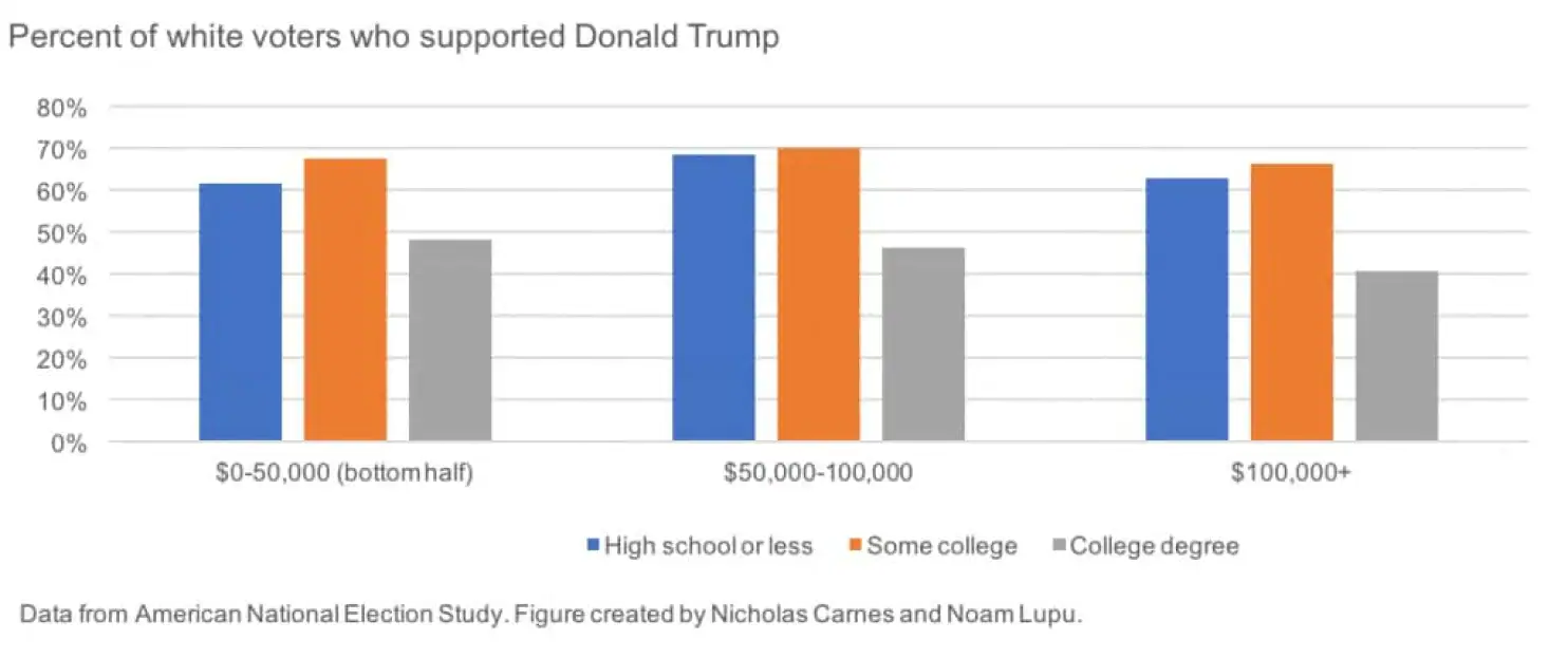
This chart is easy to misread, because it doesn’t display differences. What if in 2012, Romney got 100% of the vote from people making $100K or more, and no votes from other income segments? Then Trump would have been wildly overperforming in the <$100K groups and underperforming in the >$100K group, but you can’t see that from this chart.
In order to get a handle on what changed between 2012 (when the Democrat won) and 2016 (when the Republican won), we need to take the differences between those years.